That's rather embarrassing...
Sorry about that! It looks like your browser needs updating to view our website.
Outcome-Centred Approach™
Sorry about that! It looks like your browser needs updating to view our website.
Outcome-Centred Approach™

 Back
Back
Outcome-Centred Approach™
Outcome-Centred Approach™
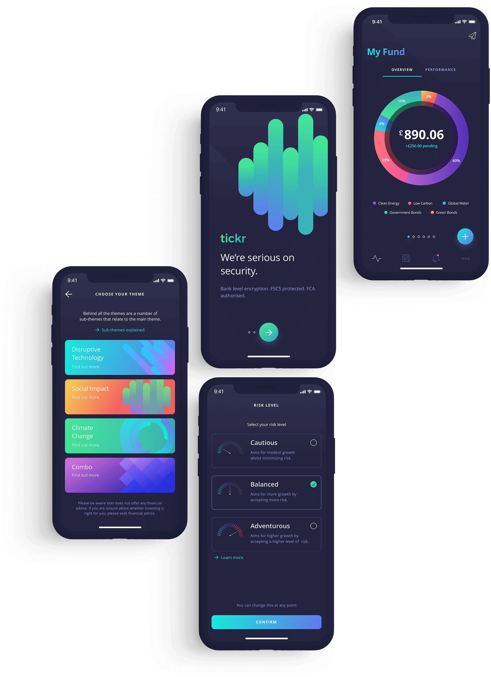
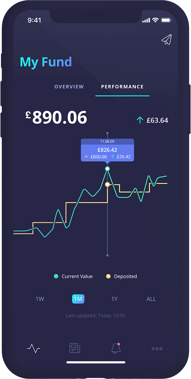
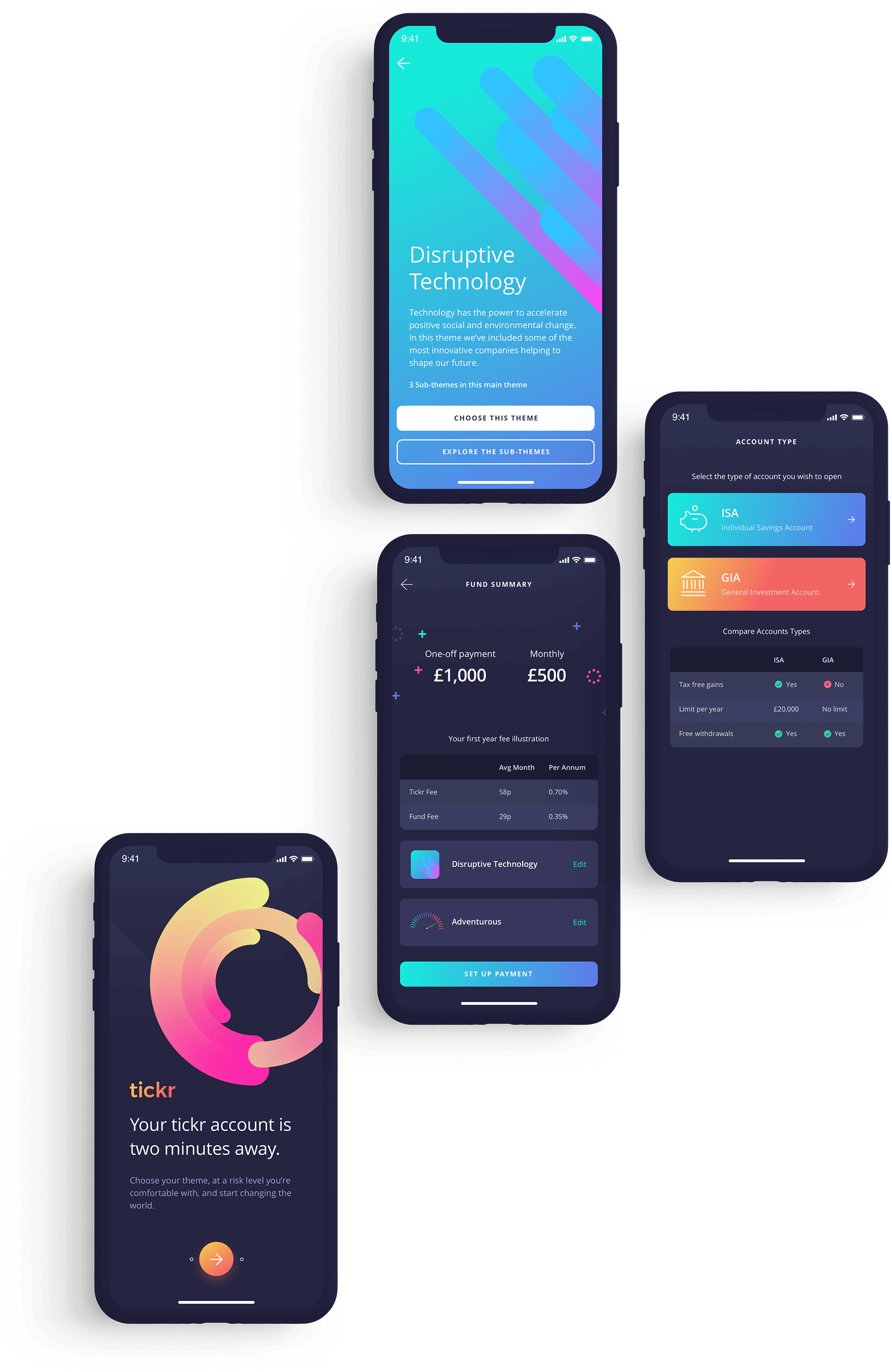
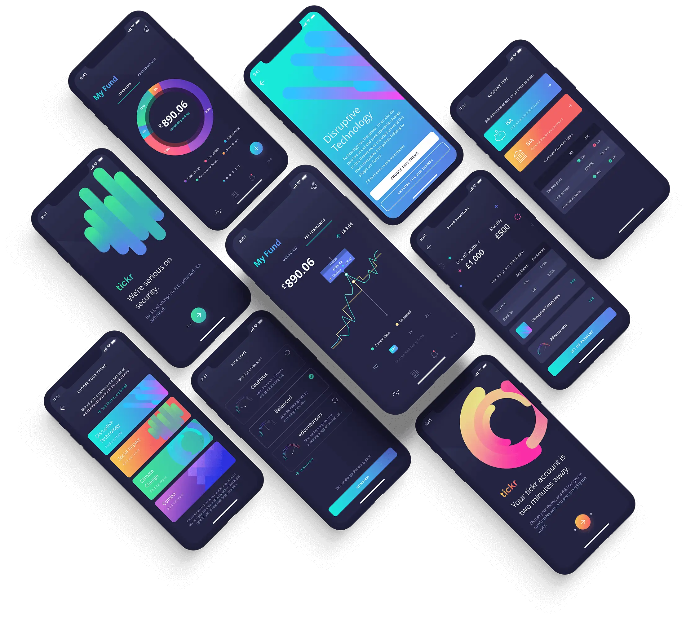
Tickr (Now Circa5000)
ServicesBranding, UX, UI, Creative Direction
Product Platforms Business TypeFintech Startup
Investing hard-earned cash can be daunting for the average millennial. Most place their money in low-interest, low-impact savings accounts, yielding small returns.
CIRCA5000’s vision was to make investing in companies that solve social and environmental issues easy for everyone. The idea is simple: match whatever the user cares about with long-term investing to give worthwhile financial returns.
Commissioned by CIRCA5000’s (formerly tickr) co-founders Tom McGillycuddy and Matt Latham, Intrface had the opportunity to design the next generation of jargon-free investment platforms from the ground up.
We were tasked with creating a future-proof brand identity aimed at Gen Ys and first-time investors. It was time to shake up the investment industry and focus on the things people genuinely care about.
In equity crowdfunding and seed rounds.
Venture capital pre-money valuation.
Registered users in 9 months of v1 launch.
First-time users converted to an investor.
Great user experiences start with meticulous design processes. We need a proven framework for success to create successful products that people love.
Understanding both the nature of the users and how this affects their needs, several deliverables are set out to build the framework. Each stage uses industry-recognised tools and methods across the two core phases; Planning & Research and Interaction Design.
This framework aims to facilitate lean design to gain insight as quickly as possible.

PLANNING & RESEARCH
Asking questions is essential for any product, but asking the right questions is vital. Asking, ‘why are we building this product?’ comes first.
We used our discovery session with CIRCA5000 to lead structured discussions to lay the groundwork and clarify the why, the what and the how. This helped us align on our shared goals, map out any challenges and craft the experience.
PLANNING & RESEARCH
We first start by detailing every user interaction point to create a tangible product.
An effective user flow identifies all possible paths and interactions a user has with a digital product. It illustrates the user’s onboarding journey, how to create an account, and the steps required to make their first investment to set up recurring payments.
Interaction Design
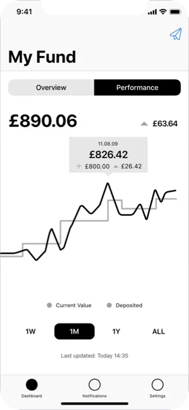
Based on the user flow mapping session, we created low-fidelity designs. These wireframes produce an interactive prototype for internal testing and validation with the team.
This method allows us to make rapid changes without the distraction of design aesthetics so we can focus on the user journey, content and holistic experience.
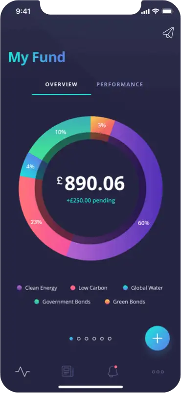
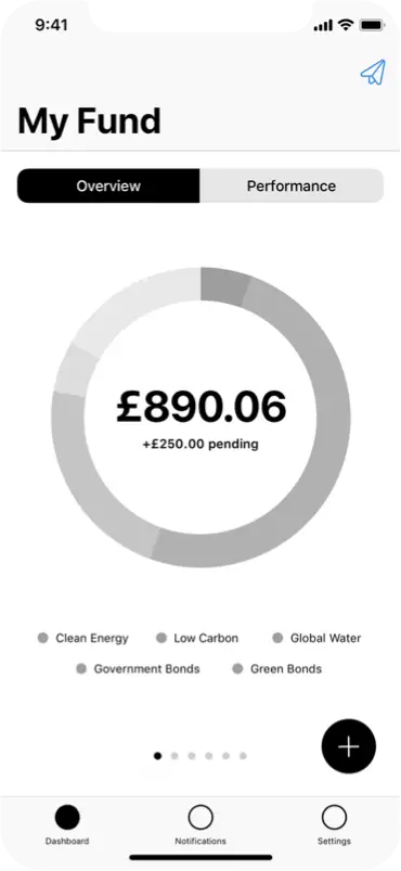
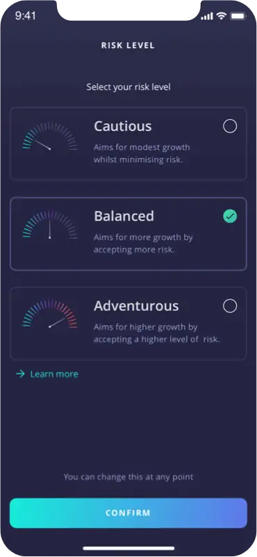
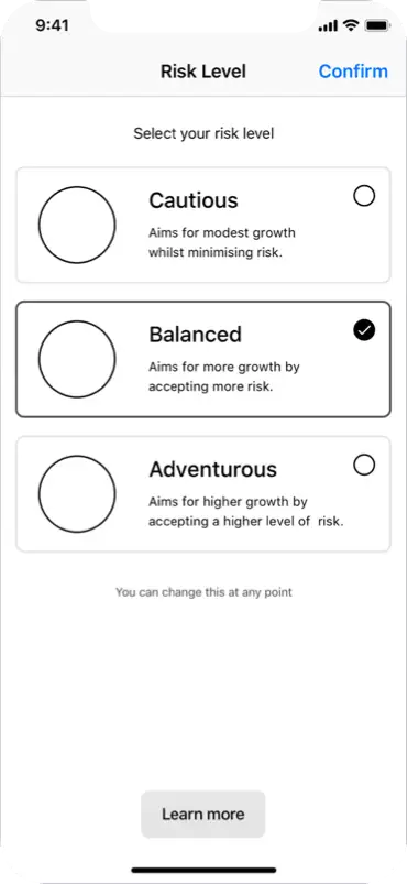
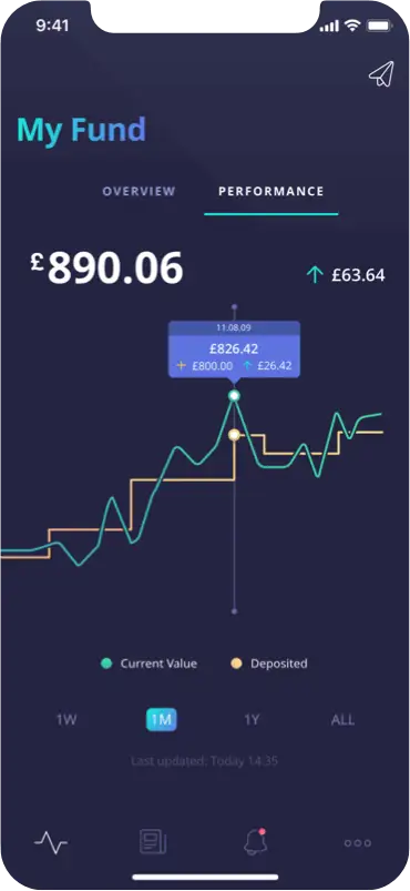



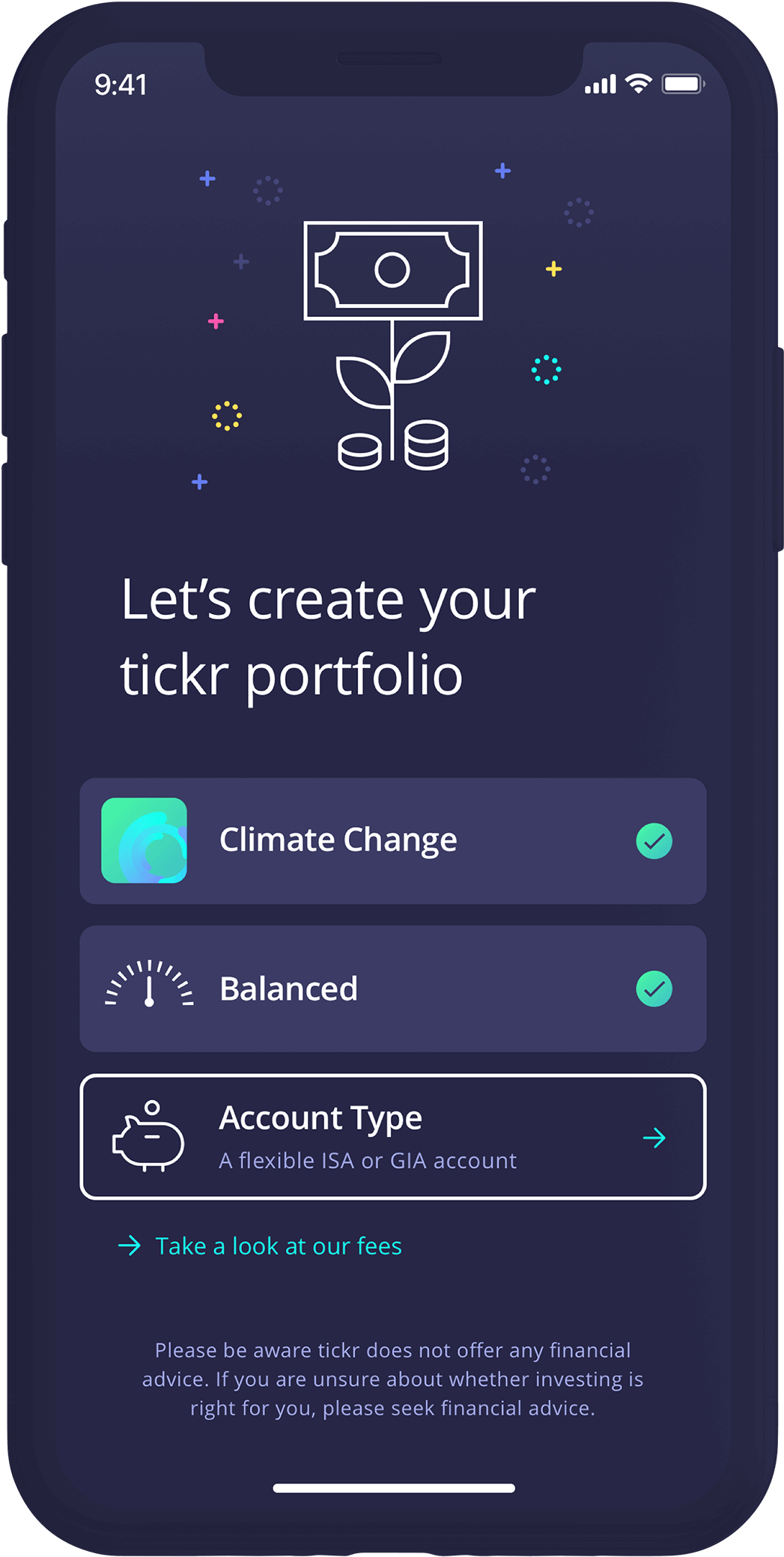
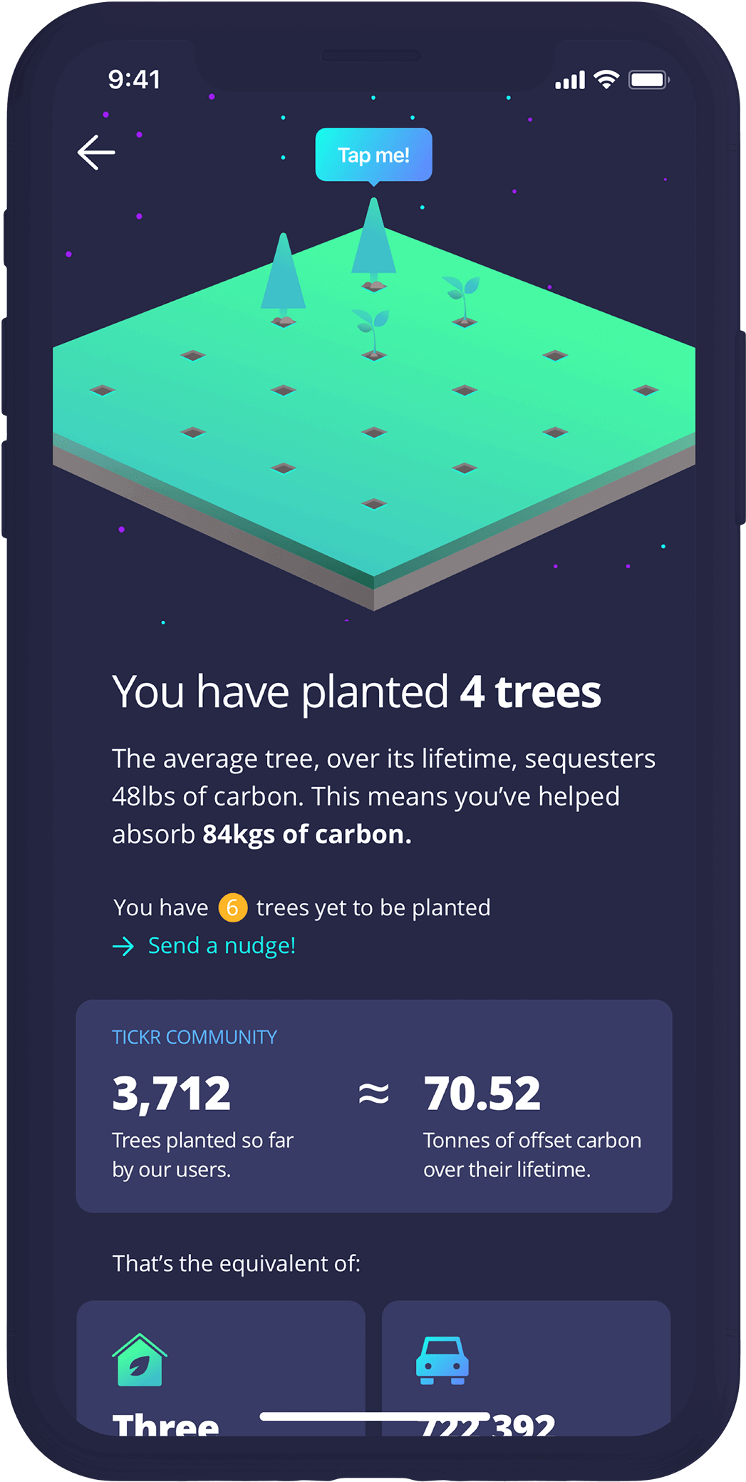
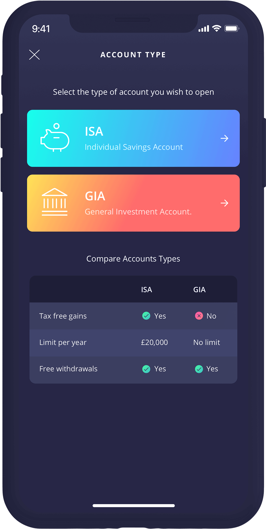

INTERACTION DESIGN
Good UX just isn’t enough. Users expect a level of movement when interacting with a product. People don’t want static experiences; they expect the UI to behave in specific ways and give them feedback as reassurance—everything from the affordance on a button state to transitioning to a new screen.
We used animation to give users the feeling of progression and evoke emotions of delight and accomplishment when they see and interact with an interface or complete a task.
TESTING & VALIDATING
User testing is key in the UX design process. It allows us to measure the effectiveness and efficiency of our design solutions by testing our assumptions on real users.
To improve the onboarding experience, we tested the streamlined flow by removing unnecessary steps in the journey.
This led to improving CIRCA5000’s user acquisitions, the activation rates and helped reduce churn.
An on-going partnership of product discovery.
Relationships are essential in business, and we’re proud to have a knack for creating tight-knit ones. Experience has taught us that good relationships lead to open conversations, collaborative thinking, and excellent products.
We became part of the CIRCA5000 team from the get-go. Working alongside product managers, developers and co-founders, we constantly learned, innovated and delivered new solutions fast.
“Intrface get things done fast! They’ve been using their talents to help us move metrics up and to the right with consistent UX and modern design. tickr wouldn’t be where it is today without their help.”
Tack sharp design, seamless UX and thousands of happy paying customers.
CIRCA5000’s vision was to give first-time investors the confidence to place their hard-earned cash into things they care about the most. Their personalised, innovative funds guide customers through the process, making investments accessible to everyone.
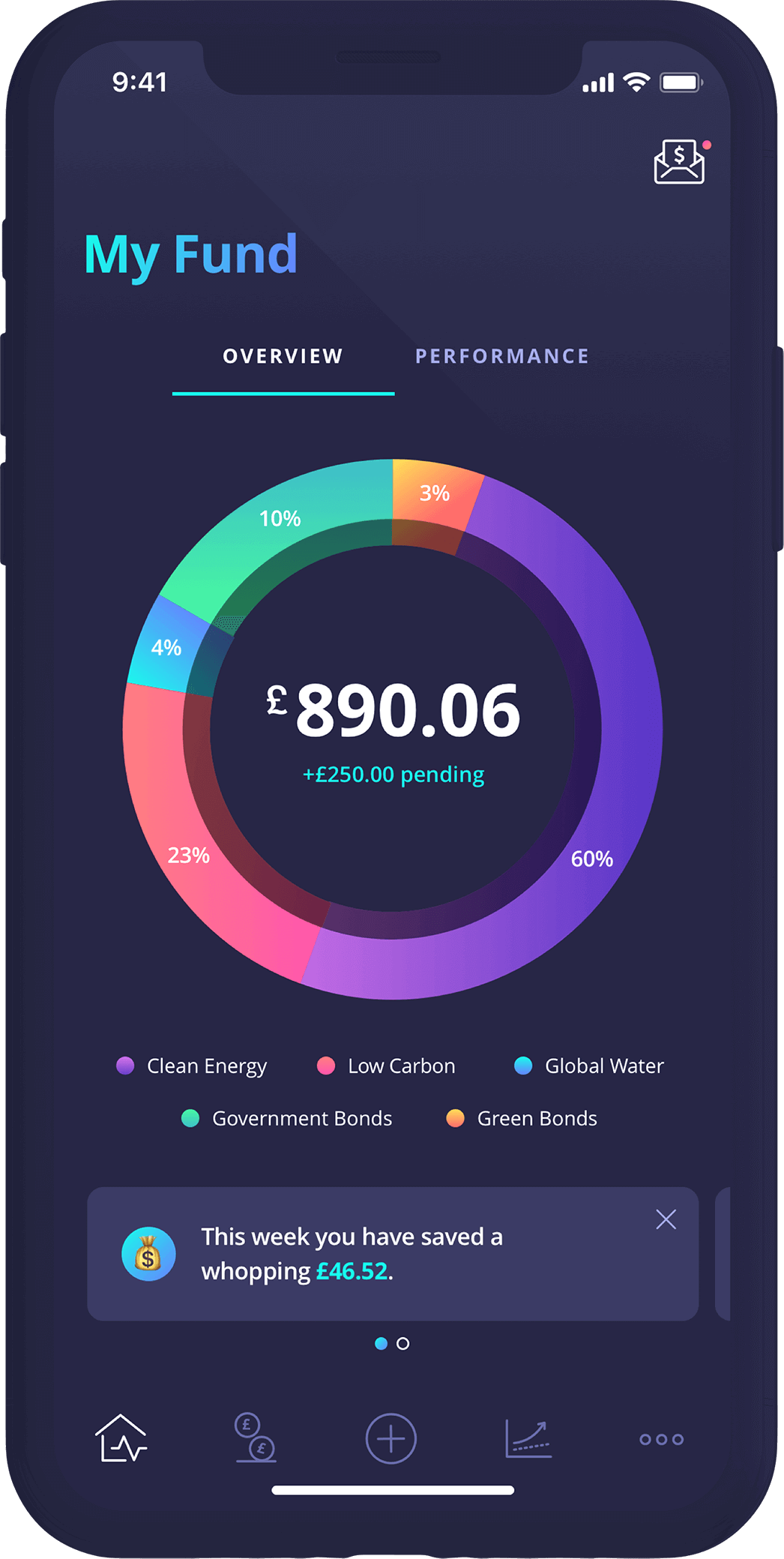
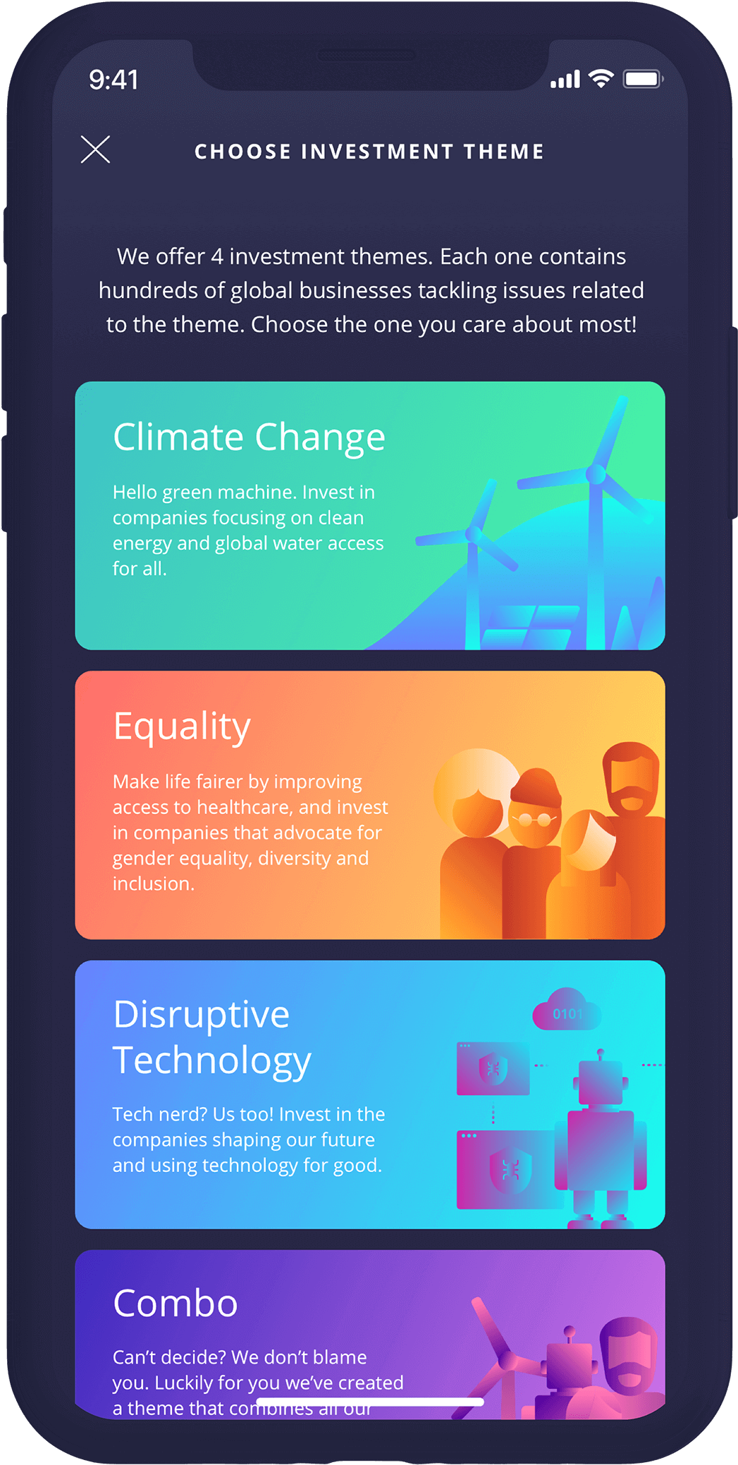
The outcome was a mobile app with an impactful millennial-focused brand, modern UI design and a flawless user experience. It increased user engagement and led to tens of thousands of paying customers.
The result is what matters. Outcomes over outputs:


We’re tracking a few things we want you to be aware of, not in an MI5 spying kind of way (you’ve got nothing to worry about). We just use the data to help us get to know our visitors better.
OK! Got it Cookie Settings